<the what>
Deutsche Parkinson Vereinigung x Havas Germany sought to make the everyday online browsing experience easier for those with tremors. We leaned into iPad's larger interface as well as it's accelerometer to create an app that negates tremors to help patients regain connection to the digital world.
<the why>
10 million
people worldwide are currently living with Parkinson's disease
70-90%
of patients develop tremors at some point during the course of their illness
~40%
of patients with tremors were reported to have difficulties using smart devices
<the how>
We did a fair amount of research on how to manipulate the iPad's accelerometer and interviewed patients about their pain points and what would be most helpful to them when using a smart device.

""
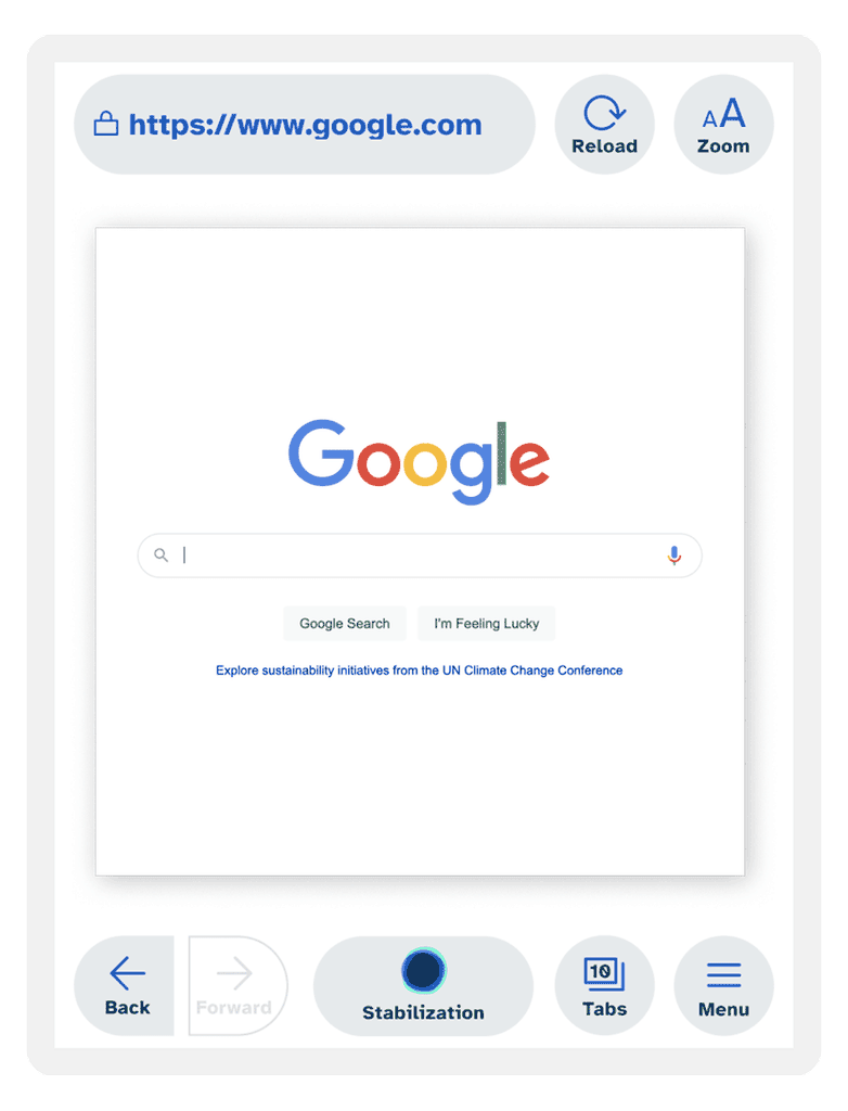
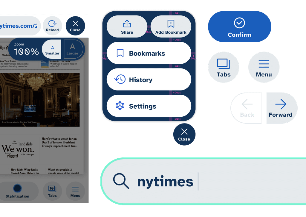
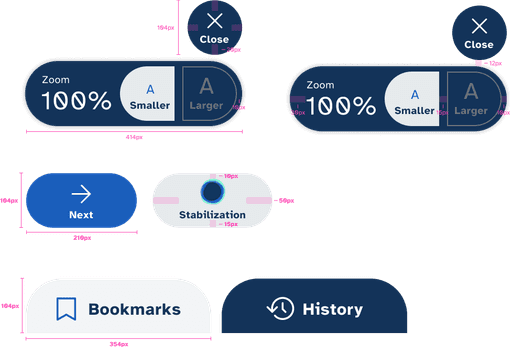
Use an easy to understand color scheme and a consistent size and shape for buttons that lead to similar actions

<the research>
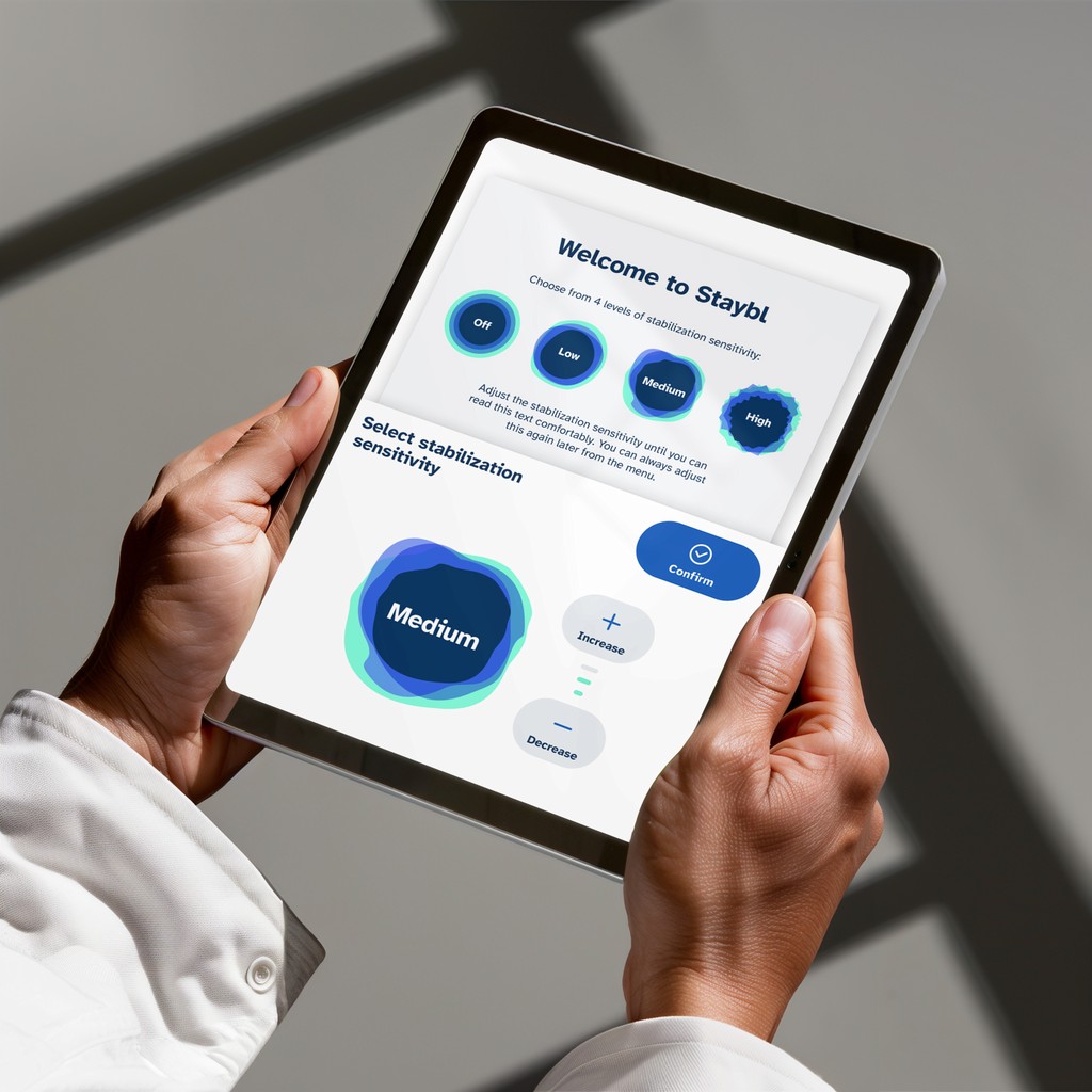
We started the project by trying to understand how the accelerometer on the iPad worked and how we would need to present the setting options on the app in order to change intensity and negate the tremors.

<the design>
After an exhaustive exploration phase, our final design direction included large rounded buttons with plenty of padding to make it easier for a user to select UI elements and a unique color palette that is ownable but with high contrast.
Our main focus was the stabliziation settings and how to make it easy for a patient to change the intensity throughout the day to match their tremors.

every element designed with accessibility in mind.
/color
When selecting the color palette, we wanted to make sure we had optimal contrast against black and white, vibrant while easy on the eyes, and at least AA compliant, with a majority of colors passing AAA compliance.
We also kept our color palette simple, using only three primary colors and a few grays to avoid overwhelming our users as they are browsing.
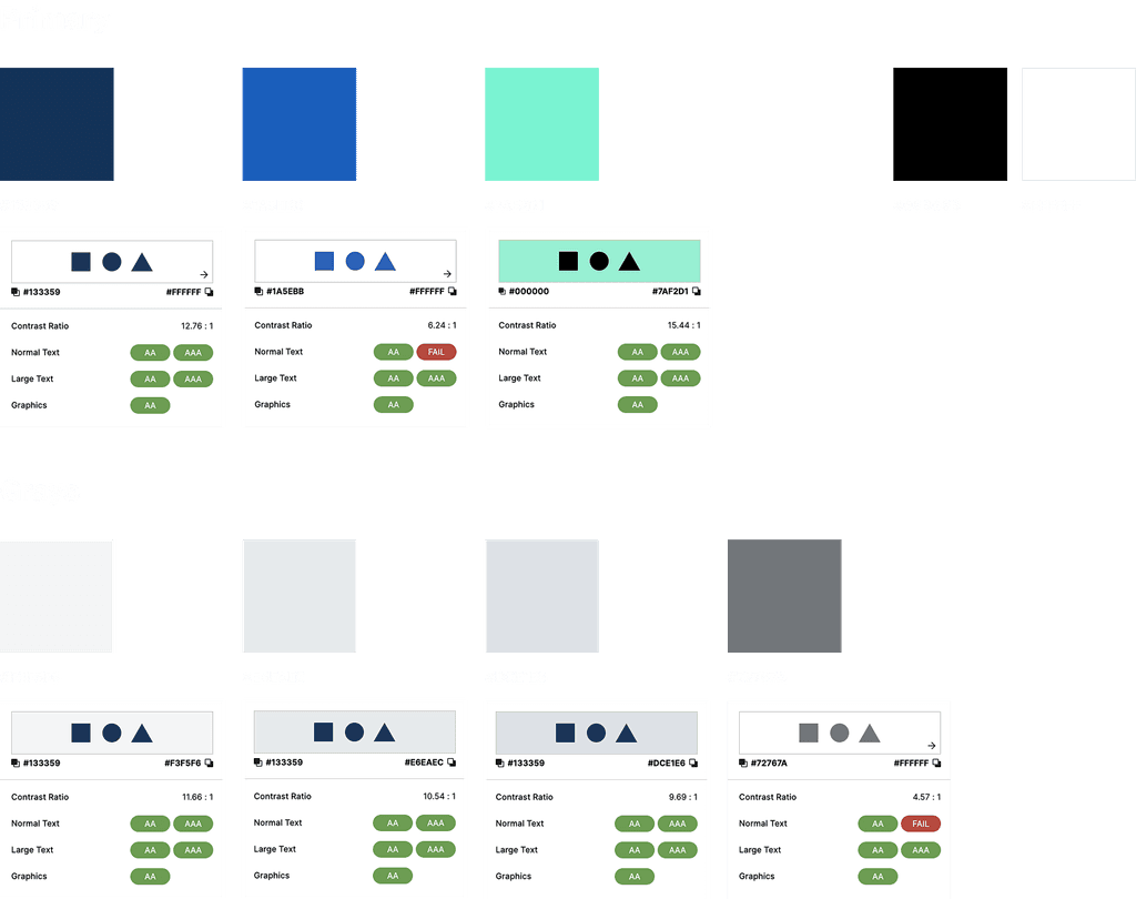
/type
We selected a typeface created by the Braille Institute, which focused on letterform distinction to increase character recognition, differentiation between similar letter pairs (e.g., P & Q), and expanded counter space.
As we created our typescale, we wanted to ensure our type sizes were as large as possible without conflicting with the main use of the app, which was browsing the web.

/Ui elements
To maximize accessibility, we created larger buttons and menu items and additional padding to make it easier for those with tremors to select the action they needed with minimal room for error.
<the results>
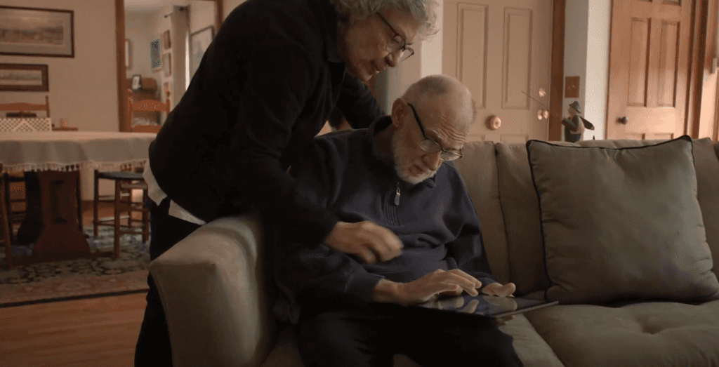
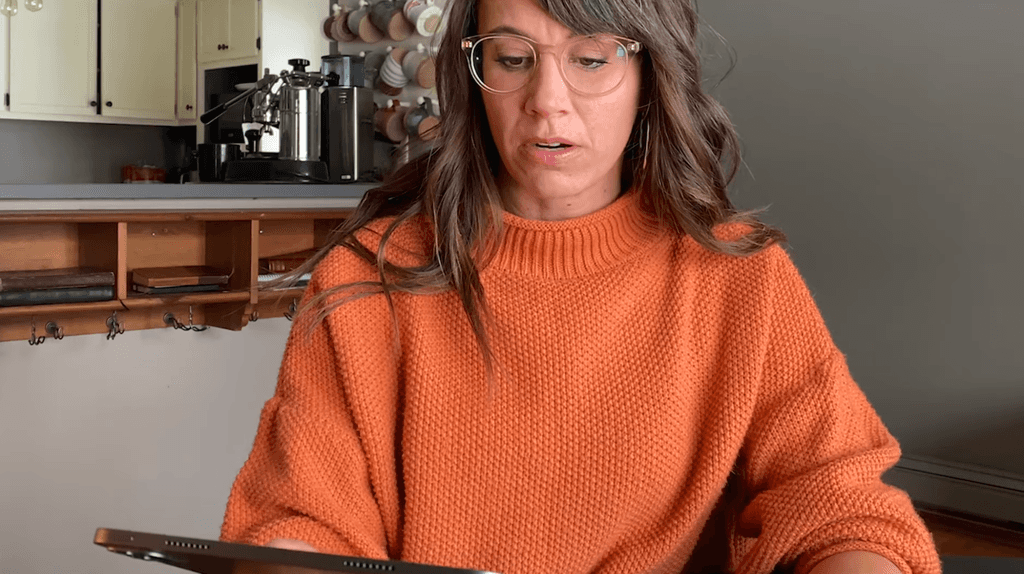
Before officially launching the app on the App Store, we went through a round of testing and asked a few Parkinson’s patients to test a prototype to make sure the tremor settings work for them and get an understanding of how helpful the app is to them.
""
[Staybl] allows me to be more involved and more independent.
""
Makes me feel less frustrated and less aware of my tremors
<the learnings>
This project provided a lot of insight into designing with accessibility at the forefront and how limiting technology can be for those with disabilities. It's inspiring to see how Staybl has benefited so many already, and the team's biggest hope is that designers and developers will keep accessibility for all in mind when creating new products.
we made a case study video.
/awards
Cannes Lions Health & Wellness - 1x Gold / 1x Silver
Cannes Lions Design - 1x Silver
Kiev International Festival - 1x Gold / 1x Silver
Epica Awards - 2x Gold / 1x Silver / 1x Bronze
Golden Award of Montreux - 1x Gold
The One Show - 2x Silver / 4x Bronze
D&AD Awards - Digital Design - Wood Pencil
The Clio Awards - 2x Silver / 6x Bronze
Annual Anthem Awards - 5x Gold / 2x Silver
WSA - World Summit Awards - 2022
Eurobest - 1x Gold / 1x Silver / 1x Bronze
LIA - London International Awards - 2x Gold / 4x Silver / 1x Bronze